Basic Accessibility Testing
This resource provides a simplified approach to accessibility evaluations. It should give you a broad sense of whether content or services follow the fundamental principles of accessibility.
Images and Videos
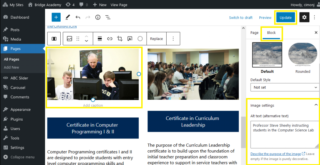
- Images that are not decorative must have alt text, either invisible data that screen readers can detect, or visible captions that can be read by everyone. Alt text can be added or checked in the WordPress editor back-end by selecting the image block and checking the alt text box in the image settings under the block tab on the right sidebar. See the screenshot below to find the alt text entry box location in the Gutenberg editor interface.

- Videos must have captions, displaying speech and sounds as they play on the video, as well as transcripts (text printouts that are not synced to the video). EOU hosts all videos on YouTube. YouTube has integrated captioning functionality, and will soon have the ability to add secondary audio tracks for audio descriptions.
- Don’t use pictures of words. If your design or editing program allows you to add real text on top of images, that is preferred over using images with words on them. If you do use images with words on them, make sure all the words are presented verbatim elsewhere, as real text.
Text and Fonts
- Use easy-to-read fonts, with a large font size.
- Avoid jargon, and define acronyms the first time they appear in your content.
- Avoid large blocks of text when possible. Break up content into sections and lists.
- Make sure your text can be resized without breaking the layout of the content. Use the ctrl + and ctrl – keys and see if you can resize your text up to 200% without loss of functionality.
Links
- Links should tell the user where they go without knowing the surrounding context, like “Eastern Oregon Admissions.” Avoid vague or generic link text like “Learn More,” or “Click Here.”
Color
Color blindness is one of the most common forms of disability, and affects all age groups but in general:
- Text must contrast against the background. If the background is a light color, make sure the text is a dark color. If the background is a dark color, make sure the text is a light color. This also applies to text in front of images.
There are several tools you can use to check for color blindness font accessibility. The Marketing Department recommends Webaim.
The other way color can be a barrier is by using color as the sole way of indicating functionality. Make sure your content uses some means besides color to indicate functionality or meaning.
- Are links given some kind of special styling besides using blue font color (i.e. underlining)? If not, people with limited color vision may miss them.
- If the content uses graphs, are the different data series given different patterns, or is the color the only way they are distinguished?
There are several tools that you can use to check for color blindness font accessibility. The Marketing Department recommends Toptal.
Keyboard Navigation
Some users are either unable to, or prefer not to navigate digital content with a mouse or with touch gestures. The most common alternative is to use the keyboard. The Marketing Department has done this work globally on the eou.edu sites.
- All content needs to be navigable by “tabbing” through the content. Press Tab on your keyboard to go forwards, Shift-Tab to go backwards.
- All interactive elements (links, buttons, etc.) on the page should receive focus.
- You should be able to activate the selected item by pressing Enter, or back out of dialog boxes or menus with Escape.
- If you navigate with the keyboard, do you always know what you’re focusing on? There should be a consistent visual indicator, like a colored box, to tell you what element on the page has focus.
- Pay special attention to menus, forms, and other types of interactive content. If you can’t do everything with the keyboard alone, it’s not accessible.