Color Guidelines
Color is frequently used on the web to improve design and convey information. Some users have partial or complete color blindness, an inability to distinguish between certain sets of colors, or an inability to see colors entirely. To ensure accessibility, digital content must have:
- Sufficient color contrast
- Use visual indicators other than color to indicate functionality.
Color Contrast
Guidelines
Text needs to contrast sufficiently against the background to be easy to read.
Color contrast is defined as a ratio between two colors, with higher contrasts being more accessible. The Web Content Accessibility Guidelines state that the contrast ratio between two colors must be at least 4.5:1 for standard sized text, and at least 3:1 for large sized text. Large text is 18 pt. font or larger, or 14 pt. bold font or larger.
How to Test
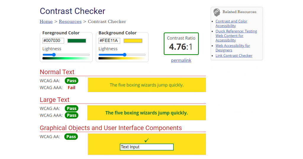
There are a variety of web-based tools for testing color contrast, one recommended tool is the WebAIM Contrast checker. In the event the current color choices are not sufficiently contrasting, this tool also provides a slider that allows you to lighten or darken colors to achieve the needed contrast.

Automated testing tools like WebAIM WAVE also test for color contrast violations on the page. These tools test against solid color backgrounds only, they are unable to identify color contrast errors in patterns, gradients, or background images or videos. These latter backgrounds must be tested manually.
Color as Identifier
Guidelines
Color cannot be the sole identifier of functionality or state on a website. It may be used to indicate functionality, but there must also be some other visual cue.
- Blue link text is not accessible. Blue and underlined link text is accessible.
- Red error messages are not accessible. Red and bold error messages are accessible.
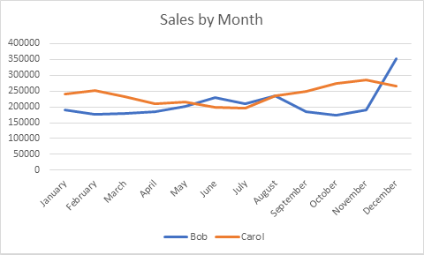
This guideline also applies to images. The following chart uses color alone to indicate information, and is inaccessible.

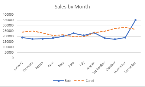
By changing the line styles and adding markers at each data point, there is an alternate way of associating each line with the respective label in the legend.

How to Test
Manually review the content and verify that color is not the sole indicator of functionality. Switch the screen to grayscale and review any graphs to make sure they can still be understood.