Accessible MS Excel Spreadsheets
Overview
This reference guide describes how to format your Microsoft Excel documents to be as accessible as possible. It builds upon the accessibility principles explained in the Accessible Document Overview guide; those principles apply to all documents, including Microsoft Excel files, so make sure you are familiar with those guidelines before proceeding here. This resource focuses on how to implement the principles in Excel.
Except where noted, this reference uses the Windows version of Microsoft Office. The Office 365 version does not provide easy access to all of the necessary accessibility features, and is not recommended unless a desktop version is otherwise unavailable.
Guidelines
Workbook and Worksheet Layout
Quick pointers on how to organize sheets within your workbook, and where to place the content within those sheets.
Sheets
- Treat cell A1 on every sheet like the title of that sheet – provide a brief description of the contents contained therein. This is where the user of assistive technology will begin navigating, and a description will help the user know what they’re reviewing.
- Begin the content on cell A2 of each sheet.
- Don’t add extra rows or columns for formatting purposes. If you want to increase the whitespace for layout purposes, widen or otherwise style the current column and/or row, rather than adding empty columns and rows. If users encounter an empty row or column, they may think they have reached the end of the content on the sheet.
Workbooks
- Each sheet in your workbook should contain a single dataset or table. Graphs/Charts should be on their own sheets. If you have multiple datasets within a single sheet, break them out into separate sheets.
- Sheets names should be descriptive and unique. Do not leave the default Sheet1, Sheet2 names.
- Delete unused sheets.
- Always save the workbook with the cursor in cell A1 of Sheet 1.
Tables and Datasets
While accessibility guidelines dictate that tables should be avoided whenever possible, Excel is the most appropriate medium to present data in tabular format, especially if the data necessitates complex tables. The following guidelines will help users of assistive technologies more easily understand the structure of tables and datasets.
Identify Table Headers
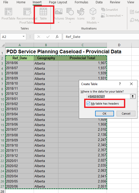
In order to prevent ambiguity, explicitly identify any headers in your table. By default, tabular data in Excel is not officially organized in a table, it’s considered a Dataset. If you do specifically identify it as a table under the Insert -> Table option, make sure the “My table has headers” option is checked. This will help screen readers understand that the first row in the table is data that applies to every other cell in the table.
Define Names for Datasets
This sounds very similar to the previous item, but is different. This applies to Datasets that are not specifically identified as Tables.
The concept of named cells is not widely understood by most Excel users. It provides a shorthand way of referring to certain parts of your dataset. Giving your headings a consistent name allows people who use assistive technology (and everyone else!) to refer to certain parts of your dataset, even without knowing which cells they occupy.
For example, if you had a dataset with a list of people and their ages, you could create a named group “Children” for everyone under the age of 18, and a named group “Adults” for everyone 18 and older. Then you could use an Excel function to find the median age of the “Children” group in your list, without needing to specify the range of cells in your sheet.
To define named cells, select the headers (rows and/or columns), right click on the highlighted cells, then choose “Define Name” from the dropdown.
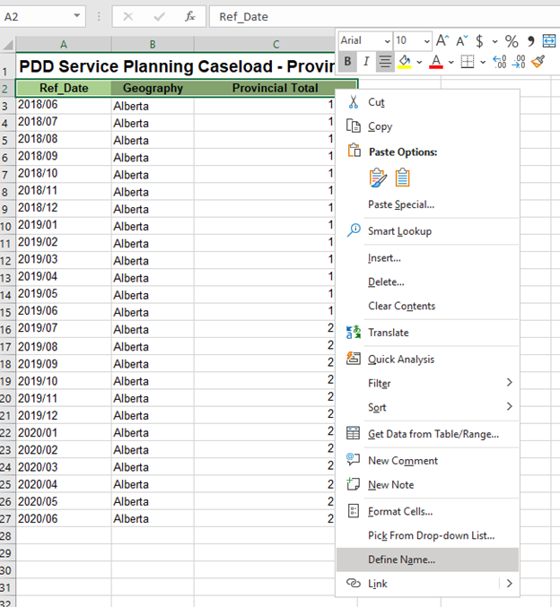
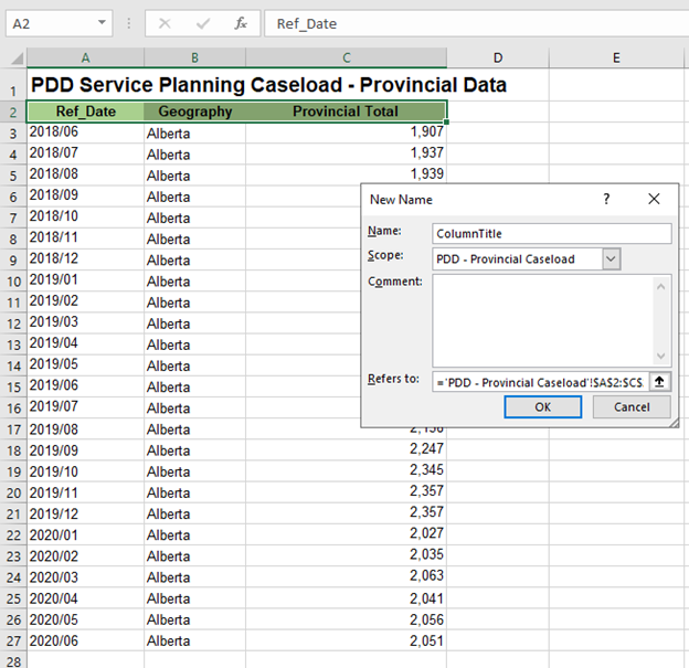
The accessibility community has adopted unofficial standards for naming table headers and columns, so people can easily jump to these parts of the sheet. The conventions are as follows:
- If your table has both column and row headers, give the name field a value of Title
- If your table has row headers only (Column A only), give the name field a value of RowTitle
- If your table has column headers only (Row 2 only), give the name field a value of ColumnTitle
The Scope defines which sheets are affected by this. Excel defaults this value to the entire workbook. Unless you have the same data in the same positions on every sheet in your workbook, change the Scope to apply only to the current sheet.
Once you’ve done this, users of assistive technology can refer to the headers even without knowing where they are in the sheet.
Avoid Merged Cells
Don’t use merged cells. You can use other purely visual stylistic techniques to emulate the appearance of merged cells, especially for elements like table headers, but the Merge Cell functionality can cause users (and their assistive technologies) to lose track of which rows and columns they are focusing on in the table.
Avoid Empty Cells
If you have cells that are missing data, use “n/a” or some other placeholder text to explicitly indicate that the data is missing or unavailable. Simply leaving the cell blank might lead the user to erroneously believe they have reached the end of the table.
Charts
Charts and graphs follow the same accessibility guidelines in Excel than they do in other mediums. The main accessibility concerns with charts in Excel is ensuring that they are sufficiently described for people who are unable to see them, and having means besides color to differentiate between data.
Describing charts requires adding both alt text and a longer plaintext description elsewhere on the document.
To add alt text, right-click on the chart, then select Edit Alt Text. Depending on your version of Excel, either a dialog box will popup, or a sidebar will slide out where you can enter alt text. You also have the option to flag this image as decorative, but charts are never decorative.
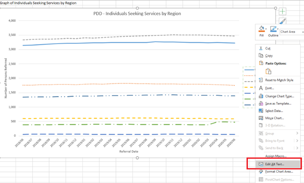
The alt text field, as in other document formats, is limited to 1 or 2 sentences. Provide a summary of what the chart represents, often similar to the chart title, versus trying to fully describe the chart within the alt text field.
The other major potential accessibility barrier is with the usage of color. Excel charts default to differentiating data solely by color. One series may be green, one may be blue, one may be red, but there are no additional indicators to tell between the data. This makes the chart inaccessible to some people with colorblindness. As a rule of thumb, if you print the chart out on a black and white printer and are unable to distinguish between the different data series, it is inaccessible.
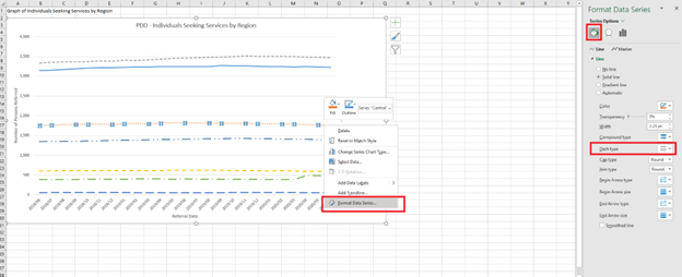
To resolve this, right click on a data series in the chart and select “Format Data Series”. You will see options to style the Fill & Line of that series, in both the chart and the legend. Here, you can choose a variety of ways to visually differentiate the different series of data. Most common is to change the Dash Type. There aren’t prescriptive steps here, so long as the different data can be visually distinguished by some means beyond color alone.
How to Test
Accessibility Checks
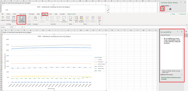
Like other Microsoft products, Excel has a convenient built-in accessibility checker. This is not an exhaustive tool, but will help you identify any common errors, like missing alt text on media and charts. Under the Review tab, clicking the Check Accessibility button will bring up a sidebar where you can review and revise accessibility errors before publishing.
Additional Resources
Sample files used in the creation of this document, using modified publicly available data from the Alberta provincial government: